


Kizen Case Study: Aligning AI Innovation with Digital Presence
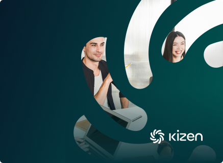
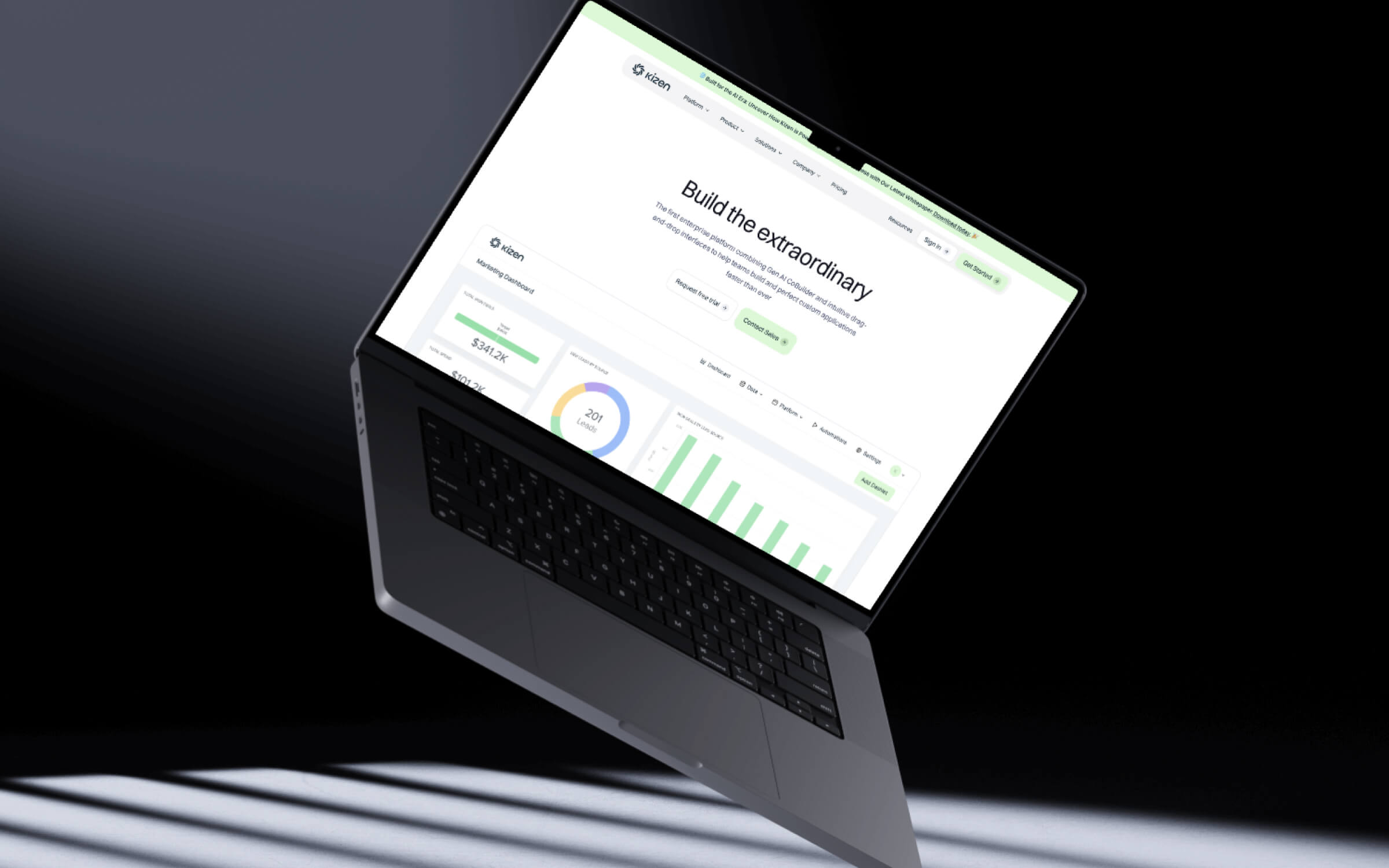
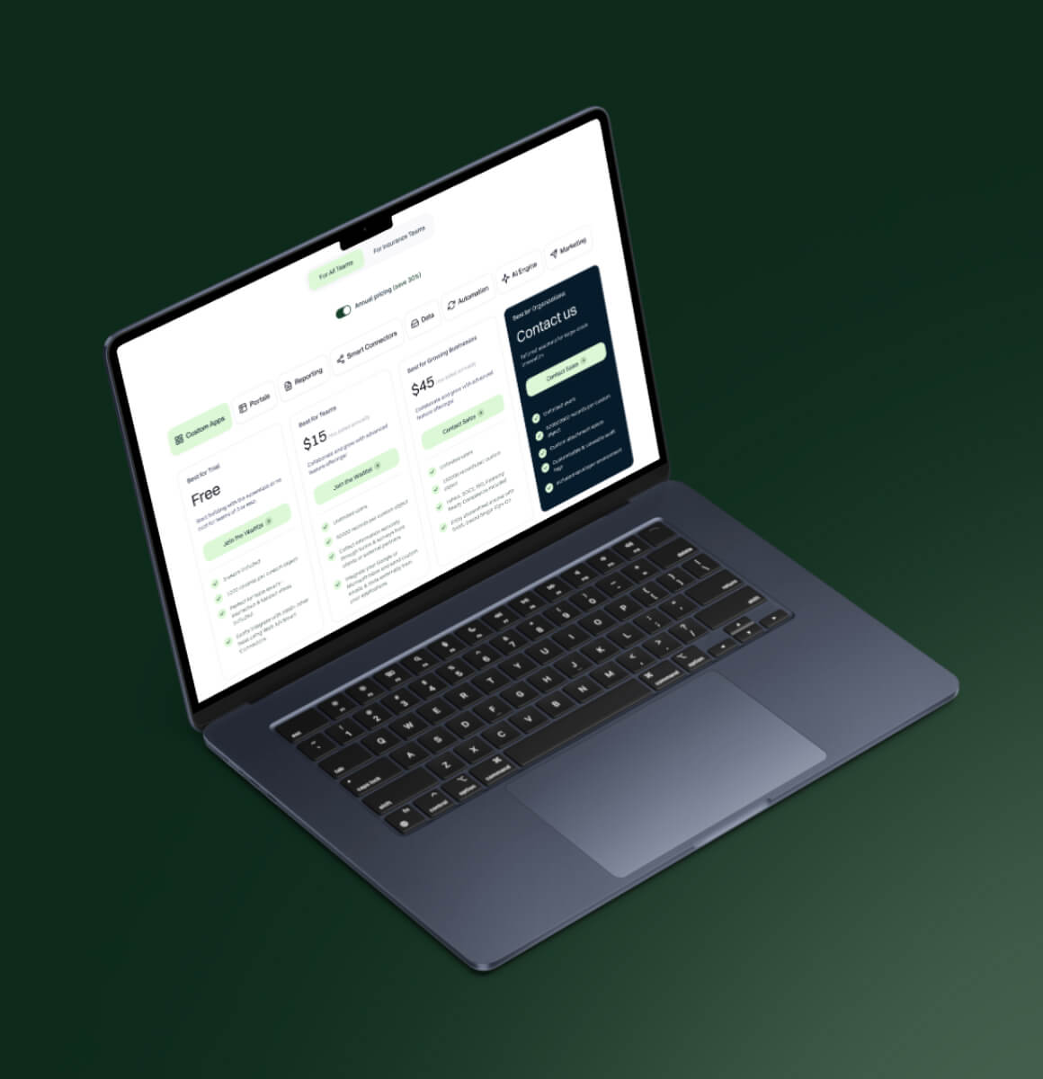
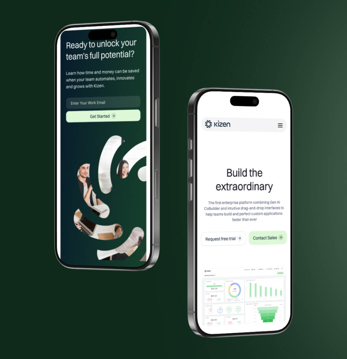
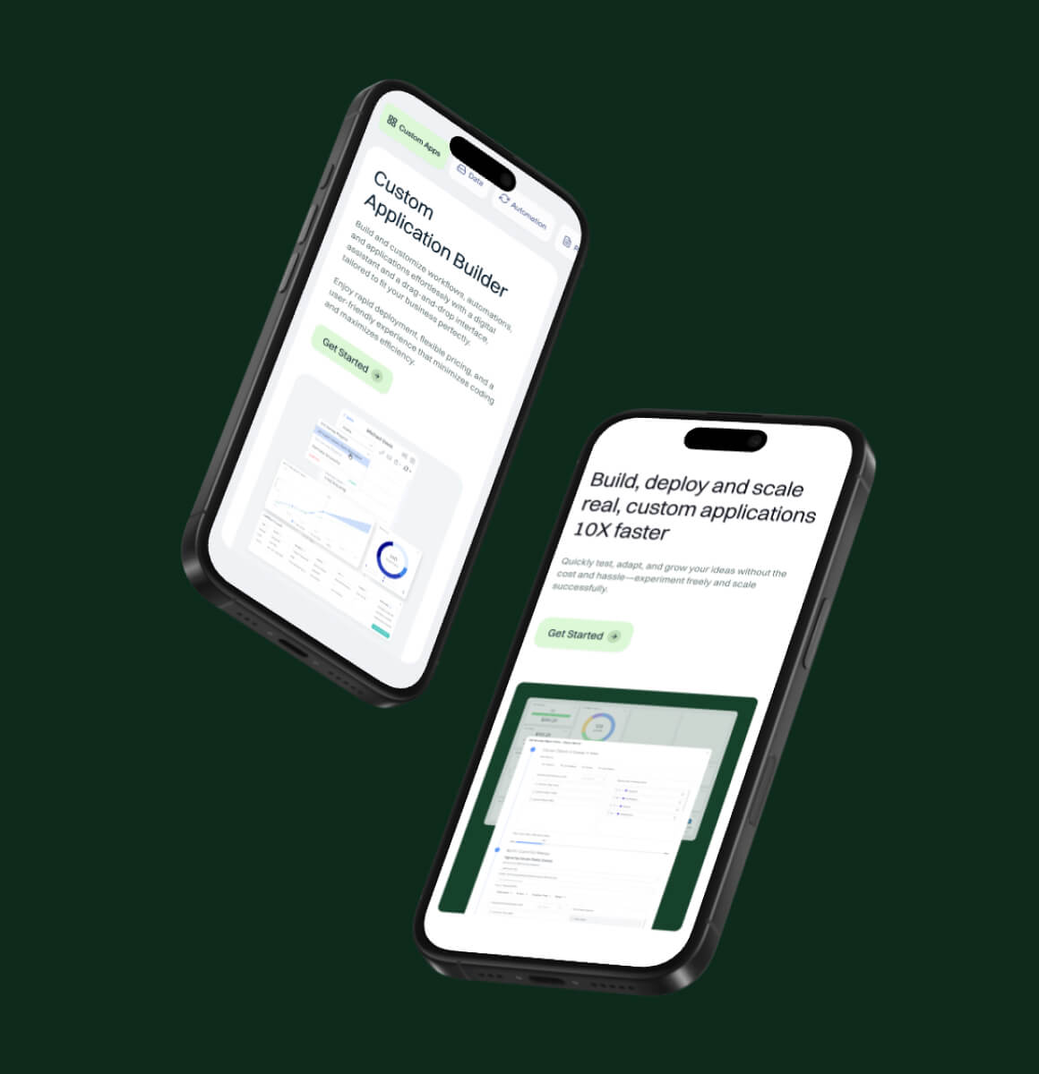
Kizen website rebranding and redesign, reflecting a new AI focus with a modern, user-friendly platform.

Results
- A modernized brand identity that accurately signals Kizen's shift to AI, replacing one that no longer matched the product.
- A distinctive logo and logotype that strengthen brand recognition.
- A clean, minimalist site that presents complex software clearly.
- Reorganized sitemap and UX, so visitors move through the site rather than around it.
- Dual optimization delivered in one build: conversion paths for lead generation and structure for organic visibility.
The Kizen’s Rebrand - A Website Redesign that Drives Leads and Powers Growth
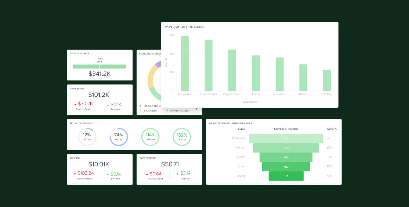
Kizen, an innovative software solutions organization, enables users to create custom applications tailored to their specific needs. Its comprehensive platform lets users automate tasks, generate insightful reports from data, and seamlessly integrate with other software systems.
Kizen faced the challenge of wanting to revamp its brand and website to reflect its cutting-edge AI focus and provide a user-friendly platform for building custom applications.
The company wanted to modernize its logo and brand identity to symbolize continuous improvement, known as "kaizen" in Japanese, and to align with its shift towards AI.
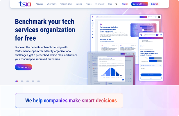
Essentially, Kizen wanted to design a modern and intuitive SaaS website that effectively showcases its new platform. To drive conversions and lead generation, the website needed to be optimized for these purposes.
Challenge
Kizen builds software that lets users create custom applications for their own needs, automating tasks, generating reports from their data and integrating with the rest of their stack.
The company had shifted toward AI, and neither its brand nor its website said so. The logo and identity needed to modernize around the idea the company is named for, kaizen, the Japanese principle of continuous improvement, and to read as current in an AI market.
The site had a second job beyond looking right. It needed to work as a modern, intuitive SaaS website that showcased the platform, and it needed to be built for conversions and lead generation rather than presentation alone. Organic reach was thin, so SEO had to be part of the build rather than a later pass.
Approach
Veza Digital rebuilt the brand and the site together so neither pulled against the other.
A new logo was designed around a whirl, closer to a tornado, carrying the continuous-improvement idea in a form that reads as contemporary AI rather than legacy software. A flowing modern logotype reinforced the sense of forward movement, and a fresh, uplifting color palette replaced the older scheme.
On the site, the sitemap and information architecture were refined so every section was reachable without hunting. The interface was built clean and minimalist, with clear copy, putting the redesigned app in front of the visitor instead of describing it.
Every page was then optimized twice over, once for conversion and once for search, so lead generation and organic visibility were designed in rather than retrofitted.

A content and WAIO-driven system that expanded visibility, authority, and AI-driven discovery.
A WAIO-driven recovery that restored visibility and established category-level rankings.
A WAIO-driven system that scaled traffic, engagement, and conversion performance.
.jpeg)
Smartrr brand and website transformation, creating a cohesive, strong visual identity with a user-centric focus.

A dynamic website with 55+ motion graphics achieved increase in conversions, visibility, and traffic.

Webflow migration merged two domains into one site, achieving a modern design and superior functionality

Kizen website rebranding and redesign, reflecting a new AI focus with a modern, user-friendly platform.
A WAIO-driven system that improved AI visibility, engagement quality, and conversion performance across search.

Multi-page Webflow site migration with user-friendly CMS and enhanced animations.
A WAIO-driven transformation that improved visibility, engagement, and AI-driven discovery across search and LLM platforms.

WordPress to Webflow migration, delivering a user-friendly CMS and enhanced user experience.

WordPress to Webflow migration significantly boosted search rankings and client inquiries.

Comprehensive SEO drove major organic traffic growth and helped secure Series A funding.